


Why a Logo is Important?
Have you ever taken a logo quiz? How often did you guess the right brand simply by its logo? For instance, brands like Tim Horton, McDo...


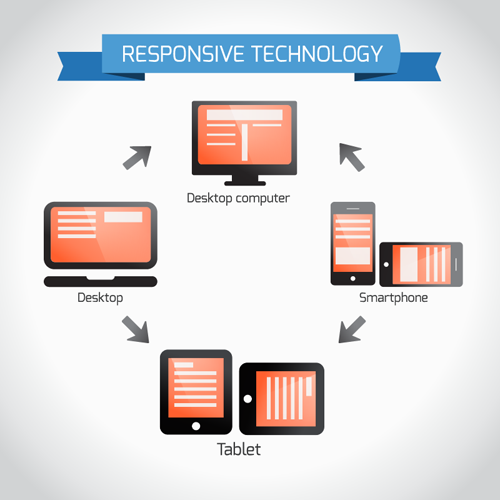
A lot of people ask what exactly does responsive website design mean? The concept can be difficult at first to understand. Website designers will advertise creating a “mobile” website, but this usually means that the website will be built separately in a smaller format for only small mobile screens or small tablet size screens but will look terrible on larger devices.
With responsive design, the website will automatically scale to the width of your screen – so no matter the size of the website, your layout will look and navigate properly. Additionally, managing your website will be much easier as you will only need to make edits to one website instead of two.
Responsive web design is based upon the use of percentages instead of fixed widths, so instead of saying “the website will be 900 pixels wide” we can develop the code so that the website is 100% width with a max width of 900 pixels resulting in the same look on a wider screen.
Responsive design can also style elements differently by screen width. If your device is only 400 pixels wide, we can style elements to look different for screen sizes of 400 pixels or smaller. We do this by using CSS media queries. We can style headers, blocks of text, and images this way. The possibilities are endless.
Choosing a responsive website design can open your target audience to any device size. With more and more people using phones and tablets to browse the internet this is an essential part of website design. If you are interested in a responsive design website, contact us today!


